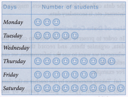
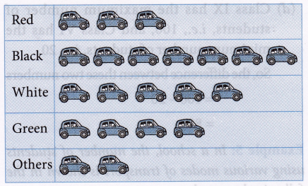
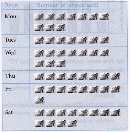
What is a Bar Graph in Statistics
Graphical representation of data
The graphical representations such as bar graphs, histograms, frequency polygons, etc.
Bar graph (diagram) of a data
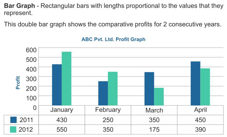
A bar graph (diagram) is a pictorial representation of the data by a series of bars or rectangles of uniform width standing on the same horizontal (or vertical) base line with equal spacing between the bars. Each rectangle or bar represents only one numerical value of the data. The height (or length in case the base is on a vertical line) of each bar is proportional to the numerical values of the data.
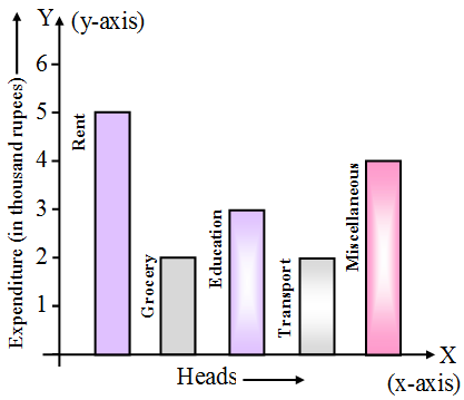
For example, we are given a data about the household expenditure of a family as below :
Heads of expenditure | Expenditure (in thousand rupees) |
Rent | 5 |
| Grocery | 2 |
Education | 3 |
| Transport | 2 |
| Miscellaneous | 4 |
We draw the bar graph for the above data as below:
The horizontal axis is generally called x-axis and the vertical axis as the y-axis.
- Each bar of a bar diagram has same width.
- Space between two consecutive bars is same throughout.
Bar Graph in Statistics Example Problems with Solutions
Example 1: In figure, the bar diagram presents the expenditure (in proportionate figures) on five different sports. If the total expenditure incurred on all the sports in a particular year be 2,00,000, then find the amount spent
(i) on hockey
(ii) on cricket
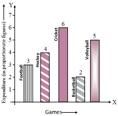 Solution: Proportionate amount spent on Football, Hockey, Cricket, Basketball, and volleyball are in the ratio 3 : 4 : 6 : 2 : 5 respectively. Total amount spent = RS. 2,00,000.
Now, 3 + 4 + 6 + 2 + 5 = 20.
Amount spent on hockey
= 2,00,000 × \(\frac { 4 }{ 20 }\)
= 40,000
Amount spent on cricket
= 2,00,000 × \(\frac { 6 }{ 20 }\)
= Rs. 60,000
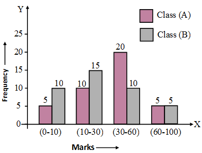
Example 2: Compare the academic standard of two classes A and B each of 40 students on the basis of the following data by making bar diagram.
Marks : | 0-10 | 10-30 | 30-60 | 60-100 |
No. of students in A : | 5 | 10 | 20 | 5 |
| No. of students in B : | 10 | 15 | 10 | 5 |
Solution:
Example 3: Read the bar graph in figure and answer the following :
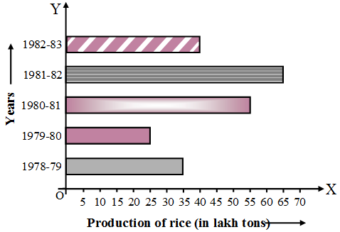
(i) What information is given by the bar graph ?
(ii) What was the quantity of rice production in the year 1980-81.
(iii) What is the difference between the maximum and minimum production of rice in the time span of 1978-1983.
Solution: (i) The bar graph, represents production of rice in the period 1978-1983 (year-wise).
(ii) The bar for 1980-81 has length = 55.
Therefore, the production of rice in the year 1980-81 is 55 lakh tons.
(iii) In the year 1981-82, the production of rice is maximum and is equal to 65 lakh tons. In the year 1979-80, the production of rice is minimum and is equal to 25 lakh tons.
The difference between the maximum and the minimum production
= 65 lakh tons – 25 lakh tons
= 40 lakh tons