How are Bar Graphs and Histograms Related
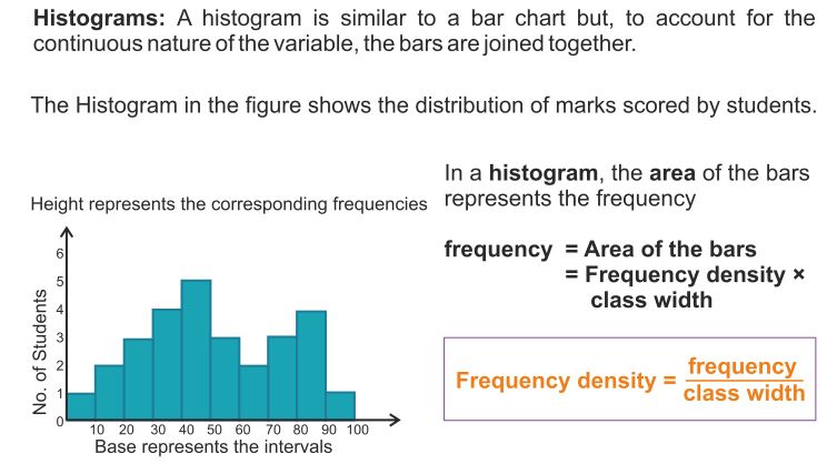
Histogram
A histogram is a graphical representation of frequency distribution in the form of rectangle with class interval as the bases and heights proportional to corresponding frequency. There is no gap between rectangles.
Construction of a histogram of a continuous grouped frequency distribution
- Take a graph paper and draw two perpendicular lines, one horizontal and one vertical, intersecting at O (say). Mark them as OX and OY.
- Take horizontal line OX as X-axis and vertical line OY as Y-axis
- Choose a suitable scale and along X-axis represent class limits
- Choose a suitable scale for Y-axis and mark frequencies along Y-axis.
- Construct rectangles with class intervals as bases and respective frequencies as heights.
Read More:
- Mean and its Advantages and Disadvantages
- Median of Grouped Frequency Distribution
- Mode in Statistics
- Pie Charts
- Frequency Polygon
Construction of a histogram of a continuous grouped frequency distribution with unequal class intervals.
- Take a graph paper and draw two perpendicular lines, one horizontal and one vertical, intersecting at O (say). Mark them as OX and OY.
- Take horizontal line OX as X-axis and vertical line OY as Y-axis.
- Choose a suitable scale along X-axis and represent class-limits on it.
- Determine a class-interval which has the minimum class size. Let the minimum class size be h.
- Compute the adjusted frequencies of each class by using the following formula:
Adjusted Frequency of a class
= \(\frac { h }{ { Class\quad size } }\) × Frequency of the class - These adjusted frequencies are the heights of each rectangle of histogram but widths will be according to class limits.
- Choose a suitable scale for Y-axis and mark adjusted frequencies along Y-axis.
- Construct rectangles with class intervals as bases and respective adjusted frequencies as heights.
Construction of a histogram when mid-points of class-intervals are given.
- Compute the difference between second and first mid-point. Let it be h.
- Divide the difference h by 2.
- Subtract \(\frac { h }{ 2 }\) from first mid-point to get the lower limit of first class and add \(\frac { h }{ 2 }\) to first mid-point to get the upper limit of first class.
- Repeat first three steps for all other mid-points.
Histogram Example Problems with Solutions
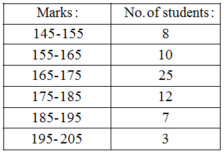
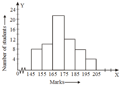
Example 1: The following table gives the marks scored by 100 students in an entrance examination.
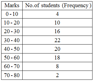 Represent this data in the form of a histogram.
Solution: We represent the class limits along X-axis on a suitable scale and the frequencies along Y-axis on a suitable scale.
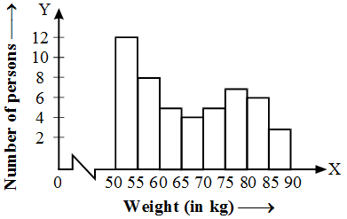
Example 2: The following is the distribution of weights (in kg) of 50 persons :
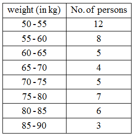 Draw a histogram for the above data.
Solution: We represent the class limits along X-axis on a suitable scale and the frequencies along Y-axis on a suitable scale.
Since the scale on X-axis starts at 50, a kink (break) is idicated near the origin to signify that the graph is drawn to scale begining at 50, and not at the origin.
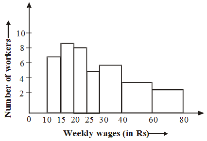
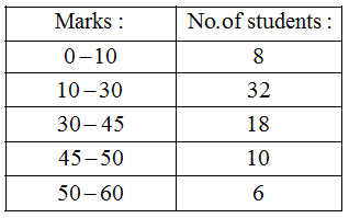
Example 3: Represent the following data by means of historgram.
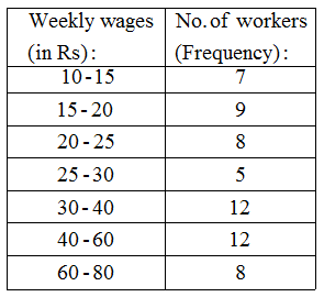 Solution: Here the class intervals are of unequal width. So, we shall first compute adjusted frequencies of each class. The minimum class size is 15 – 10 = 5. The adjusted frequencies are computed by using the following formula :
Adjusted frequency of a class
= \(\frac { { Minimum\quad class-size } }{ { Class-size } } \) × Frequency of the class
The adjusted frequencies are computed in the following table :
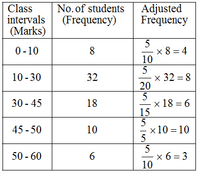
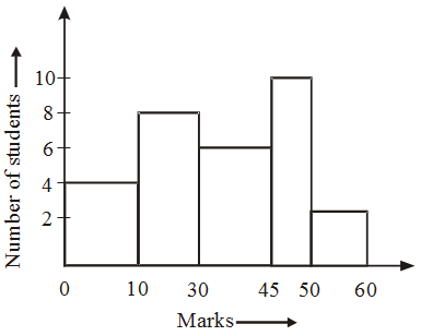
Example 4: Draw a histogram for the marks of students given below:
 Solution: Here, minimum class-size = 5.
So, we adjust the frequencies by using the following formula:
Adjusted frequency of a class
= \(\frac { { Minimum\quad class-size } }{ { Class-size } } \) × Frequency of the class
The adjusted frequencies are computed as follows :
Example 5: Construct a histogram from the following distribution of total marks obtained by 65 students of IX class in the final examination.
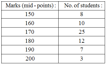 Solution: Ascertainment of lower and upper class limits
Since the difference between the second and first mid-point is 160 – 150 = 10.
∴ h = 10 ⇒ \(\frac { h }{ 2 }\) = 5.
So, lower and upper limits of the first class are 150 – 5 and 150 + 5 i.e. 145 and 155 respectively.
∴ First class interval is 145 – 155.
Using the same procedure, we get the classes of other mid-points as under :
 The histogram of the above frequency distribution is given in Fig.
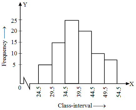
Example 6: Draw a histogram for the following data:
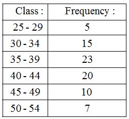 Solution: The histogram of the above frequency distribution is given in Fig.
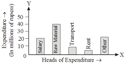
Example 7: The expenditure of a company under different heads (in millions of rupees) is given below.
Head | Expenditure |
salary | 20 |
Raw material | 40 |
Transport | 10 |
| Rent | 5 |
| Others | 15 |
Draw a bar chart to depict the above data.
Solution: The required bar chart is given below :
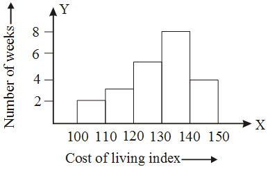
Example 8: Draw a histogram for the data given below.
Cost of living index | Number of weeks |
100-110 | 2 |
110-120 | 3 |
| 120-130 | 5 |
130-140 | 8 |
| 140-150 | 4 |
Solution: The required histogram is given below
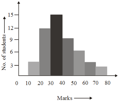
Example 9: Draw a histogram to represent the following data of marks obtained by 50 students of a class.
Marks | No. of students |
10-20 | 4 |
20-30 | 12 |
| 30-40 | 15 |
40-50 | 8 |
| 50-60 | 5 |
60-70 | 4 |
| 70-80 | 2 |
Solution: The class intervals showing the marks are taken along the X-axis and the number of students along the Y-axis. The histogram is shown below.
Example 10: The daily earnings of 40 workers of a factory are given below :
Daily earnings (in rupees) | No. of workers |
51-60 | 5 |
61-70 | 10 |
| 71-80 | 12 |
81-90 | 6 |
| 91-100 | 4 |
101-110 | 3 |
Solution: The given distribution is inclusive (discontinuous). So we are to change it to a continuous distribution. As the gap between the upper limit of the first class and the lower limit of the second class is 1, the true class limits of the first class are 50.5 and 60.5. The class boundaries (true class limits) of the other classes are similarly determined. The continuous distribution table is then shown below.
Daily earnings (in rupees) | No. of workers |
50.5 – 60.5 | 5 |
| 60.5 – 70.5 | 10 |
70.5 – 80.5 | 12 |
| 80.5 – 90.5 | 6 |
90.5 – 100.5 | 4 |
| 100.5 – 110.5 | 3 |
The histogram is shown below.
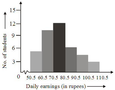 The earning are taken along the horizontal axis and the number of workers along the vertical axis. As we start from 50.5 (not zero according to scale) a kink (break) is indicated near the origin to show that the graph is drawn to scale, starting from 50.5.