How do you Represent the Data in Statistics
Representation of data
There are many ways to represent numerical data pictorially. Such as pictographs, bar graphs, etc. These graphs help in the suitable representation of the data.
Pictograph
A pictograph is a way of representing data using pictures or symbols to match the frequencies of different information or events.
Read More:
- How are Bar Graphs and Histograms Related
- Bar Graph in Statistics
- Median of Grouped Frequency Distribution
- Mean and its Advantages and Disadvantages
- Mode in Statistics
- Pie Charts
- Frequency Polygon
Example 1: In a class of 25 children, absentees in a particular week were shown by a pictograph as shown here:
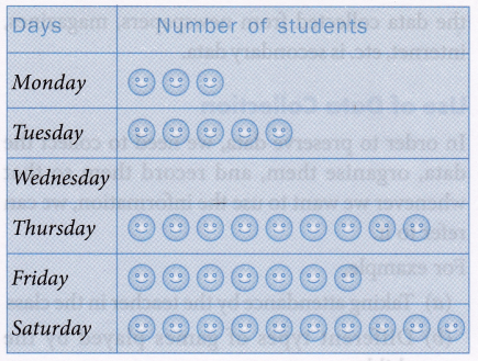
Read the pictograph and answer the following questions:
(a) How many children were absent on Wednesday?
(b) How many children were present on Saturday?
(c) On which day only three absentees were there?
(d) On which day maximum absentees were there?
Solution:
(a) None was absent on Wednesday.
(b) 15 children were present on Saturday.
Number of absentees =10
Total number of students = 25
Number of present students =25-10 = 15
(c) On Monday, there were only three absentees.
(d) On Saturday, there were the maximum number of absentees.
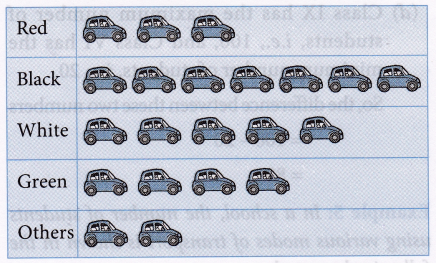
Example 2: In a park, Gaurav collected information about the colours of cars on a particular day. The information is given below:
| Colour of cars | Red | Black | White | Green | Others |
| Number of cars | 45 | 105 | 75 | 60 | 30 |
Draw a pictograph for the above data.
Scale: ![]() = 15 cars
= 15 cars
Solution:
Bar graph
A bar graph is a chart with rectangular bars of equal width and lengths, proportional to the values that they represent. The bars can be horizontal or vertical with equal spacing between them. It is also called a column graph.
Construction of a bar graph
To draw a bar graph, we draw two mutually perpendicular lines on a plane paper. The horizontal line is called x-axis and the vertical line is called y-axis. If the columns are drawn on a horizontal line (x-axis), the scale of heights of the bars is shown along the y-axis or vice versa.
For drawing bar graphs the following points should be kept in mind:
1. The width of the column (bar) should be uniform throughout.
2. The gap between the bars should be uniform throughout.
3. Bars may be horizontal or vertical.
4. Choose a suitable scale for determining the height of bars.
The vertical bars are preferred because they give a better look. To construct a bar graph, a suitable scale has to be decided on either axis, so that the lengths or heights of bars can be represented in the graph.
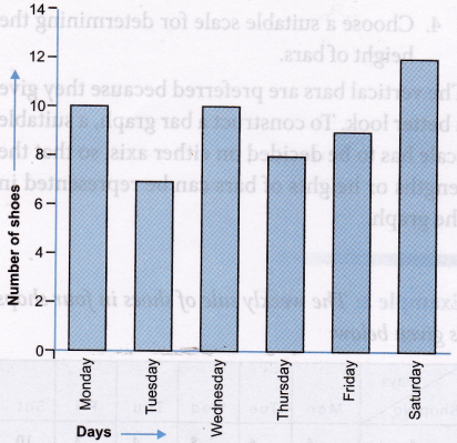
Example 3: The weekly sale of shoes in four shops is given below:
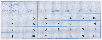
Draw a pictograph and a bar graph representing the weekly sale of shop no. 4.
Solution: Pictograph for the sale of shoes in shop no. 4:
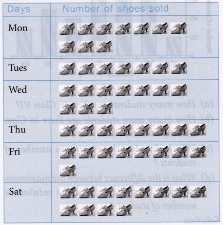
Bar graph for the sale of shoes in shop no. 4
Example 4: The following graph shows the number of students in each class of a school. Study the graph and answer the questions that follow:
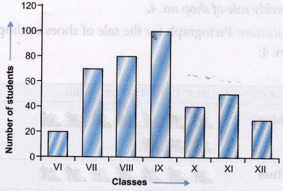
(a) How many students are there in Class VI?
(b) How many more students are there in Class IX than in Class VIII?
(c) Which class has the maximum number of students ?
(d) What is the difference between the maximum number of students and the minimum number of students?
Solution:
(a) Number of students in Class VI is 20.
(b) Number of students in Class IX is more than that of Class VIII = 100 – 80 = 20
(c) Class IX has maximum number of students.
(d) Class IX has the maximum number of students, i.e., 100, and Class VI has the minimum number of students, i.e., 20.
So, the difference between these two numbers = 100 – 20 = 80
Example 5: In a school, the number of students using various modes of transport is shown in the following bar graph:
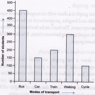
Read the graph and answer the following questions:
(a) How many students go by car?
(b) How many students travel by bus?
(c) Which mode of transport is most commonly used?
(d) Which mode of transport is least used?
Solution:
(a) 150 students go by car.
(b) 450 students use the bus.
(c) Bus is the most common mode of transport.
(d) Cycle is the least used by the students.