Scatter Plots and Models
Before attempting a regression analysis of data, it is often helpful to examine a scatter plot of the data to see which regression model is most likely going to be a good fit. Keep in mind that when working with real world data, it is unlikely that any regression model is going to be a “perfect” fit. The goal is to find the model that fits as many of the data points as possible and will be the best indicator of trends in the data.
A scatter plot graphically displays two related sets of data. Such a visual representation can indicate patterns, trends and relationships.
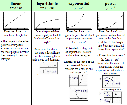
On this page, we will be concentrating on examining scatter plots to determine whether a linear, logarithmic, exponential or power regression model would be most appropriate.
Basic things to look for when looking for a model:
If the “shape” of more than one model appears to fit the data, test all of your choices to see which model is actually the best fit and the best predictor.
Remember that other representations of these shapes may also exist due to the different natures of the data.
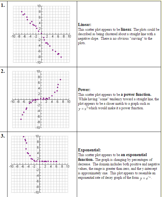
Examples:
Which type of function (linear, exponential, logarithmic, or power) would best model the data in each of the scatter plots shown below? Explain your reasoning.