Measures of Central Tendency
You are already familiar with measures of central tendency used with single data sets:
mean, median and mode.
Let’s quickly refresh our memories on these methods of indicating the center of a data set:
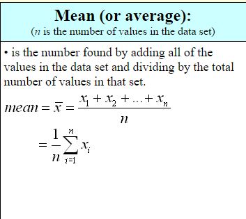
Median (middle):
(n is the number of values in the data set)
•is the middle number in an ordered data set. The number of values that precede the median will be the same as the number of values that follow it.
To find the median:
1. Arrange the values in the data set into increasing or decreasing order.
2. If n is odd, the number in the middle is the median.
3. If n is even, the median is the average of the two middle numbers.
Mode (most):
(least reliable indicator of the center of the data set)
• is the value in the data set that occurs most often. When in table form, the mode is the value with the highest frequency.
If there is no repeated number in the set, there is no mode.
It is possible that a set has more than one mode.
It is possible to get a sense of a data set’s distribution by examining a five statistical summary, the (1) minimum, (2) maximum, (3) median (or second quartile), (4) the first quartile, and (5) the third quartile. Such information will show the extent to which the data is located near the median or near the extremes.
Quartiles:
We know that the median of a set of data separates the data into two equal parts. Data can be further separated into quartiles. Quartiles separate the original set of data into four equal parts. Each of these parts contains one-fourth of the data.
Quartiles are percentiles that divide the data into fourths.
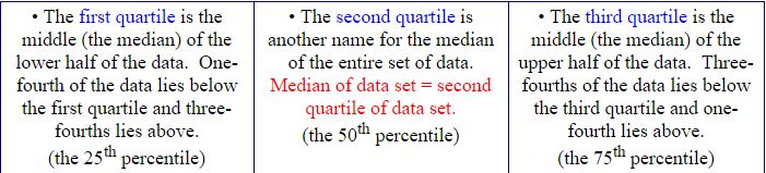
A quartile is a number, it is not a range of values. A value can be described as “above” or “below” the first quartile, but a value is never “in” the first quartile.
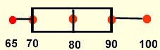
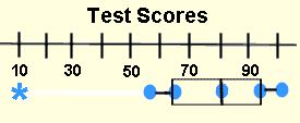
Consider: Check out this five statistical summary for a set of tests scores.

While we do not know every test score, we do know that half of the scores is below 80 and half is above 80. We also know that half of the scores is between 70 and 90.
The difference between the third and first quartiles is called the interquartile range, IQR.
For this example, the interquartile range is 20.)
The interquartile range (IQR), also called the midspread or middle fifty, is the range between the third and first quartiles and is considered a more stable statistic than the total range. The IQR contains 50% of the data.
Box and Whisker Plots:
A five statistical summary can be represented graphically as a box and whisker plot. The first and third quartiles are at the ends of the box, the median is indicated with a vertical line in the interior of the box, and the maximum and minimum are at the ends of the whiskers.
Box-and-whisker plots are helpful in interpreting the distribution of data.
NOTE: You may see a box-and-whisker plot which contains an asterisk.
Sometimes there is ONE piece of data that falls well outside the range of the other values. This single piece of data is called an outlier. If the outlier is included in the whisker, readers may think that there are grades dispersed throughout the whole range from the first quartile to the outlier, which is not true. To avoid this misconception, an * is used to mark this “out of the ordinary” value.
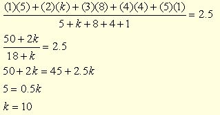
Example of working with grouped data: A survey was taken in biology class regarding the number of siblings of each student. The table shows the class data with the frequency of responses. The mean of this data is 2.5. Find the value of k in the table.
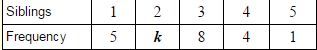
Solution: Set up for finding the average (mean), simplify, and solve.