Kerala Plus One Economics Chapter Wise Previous Questions Chapter 14 Presentation of Data
Question 1.
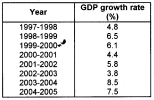
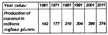
The table below shows the GDP growth rate at 93-94 prices. Present it in a frequency curve and make an inference from it. (March 2009)
Answer:
Draw a diagram by making Year on the x-axis and GDP on the y-axis.
Inference: The GDP growth rate shows frequent fluctuations. It increases first, then starts declining and reaches the minimum in the year 2002-2003. Then there is a sharp increase in 2003-04. Again in 2004-05, it slightly declines.
Question 2.
Suppose you have to study the availability of safe drinking water in your locality. Prepare a questionnaire containing at least 12 questions for this purpose. (March 2009)
Answer:
Prepare appropriate questions.
Question 3.
Pick the odd one out and justify your answer. (Say 2009)
Histogram, Pie diagram, frequency curve, frequency polygon.
Answer:
Pie diagram. Others are related to frequency distribution.
Question 4.
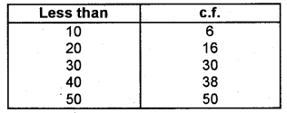
The following table shows scores obtained by 50 students in the Model Examination: (Say 2009)
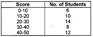
Answer the following questions.
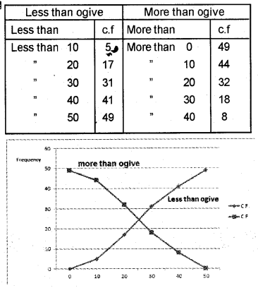
1) Draw less than and more than ogive.
2) Show the intersection point and interpret the corresponding score.
Answer:
Less than cumulative frequency
More than cumulative frequency
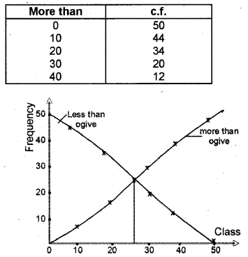
The intersecting point gave the value 26.42. This value is the median.
Question 5.
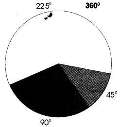
Draw a Pie-diagram for the following data pertaining to the sale of products in a market per day. (March 2010)

Answer:
Vegetables = \(\frac{500}{800} \times 360^{\circ}\) = 225°
Meat = \(\frac{200}{800} \times 360^{\circ}\) = 90°
Eggs = \(\frac{100}{800} \times 360^{\circ}\) = 45°
Question 6.
Complete the parts of the statistical table given below. (March 2011)
Answer:
Question 7.
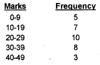
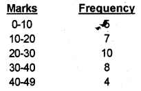
The following are the marks obtained by 30 students in a class. Draw a Histogram. (March 2011)
Answer:
Histogram
Question 8.
Represent the following data by a suitable bar diagram. (March 2012)
Answer:
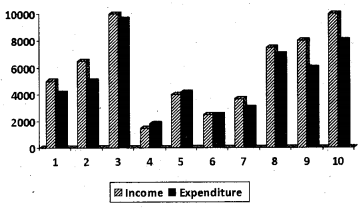
Question 9.
Income and expenditure often families are given below. Draw a multiple bar diagram using the data. (Say 2012)
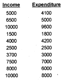
Answer:
Question 10.
Write another name for the component bar diagram. (Say 2012)
Answer:
Subdivided bar diagram
Question 11.
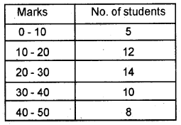
The marks secured by 60 students in an examination are given below. (March 2013)
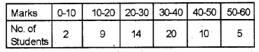
a) Prepare the schedules for less than and more than ogive.
b) Draw them.
c) Locate the median graphically.
Answer:
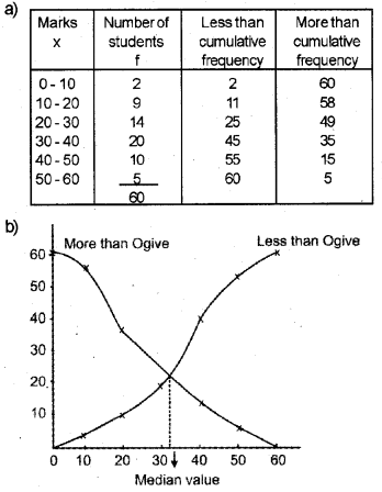
c) Median is 32.5
Question 12.
While preparing a frequency distribution, your friend is confused about inclusive and exclusive classes. Help her to distinguish between them, with examples for each. (March 2013)
Answer:
Inclusive Method
In comparison to the exclusive method, the Inclusive Method does not exclude the upper-class limit in a class interval. It includes the upper class in a class. Thus both class limits are parts of the class interval. An example of the inclusive method of a frequency distribution is given below.
Exclusive Method
The classes, by this method, are formed in such a way that the upper-class limit of one class equals the lower class limit of the next class. In this way, the continuity of the data is maintained. That is why this method of classification is most suitable in the case of data of a continuous variable. Under the method, the upper-class limits excluded but the lower class limit of a class is included in the interval.
Question 13.
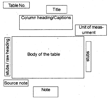
While explaining the parts of a table, your teacher says, “It narrates the content of the table. It has to be very clear and brief.” Identify the part of the table mentioned here. (March 2013)
Answer:
Title of the table
Question 14.
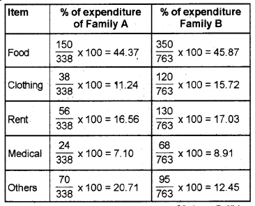
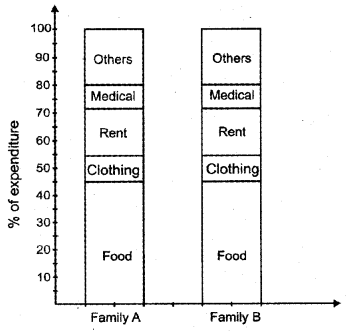
The following table shows the monthly expenditure of two families. Present the data by means of a component bar diagram. (Say 2013)
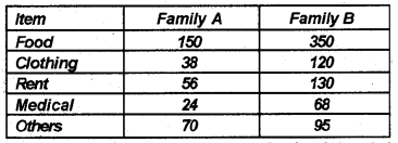
Answer:
Question 15.
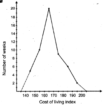
In a city, the weekly observations made in a study on the cost of the living index are given in the following table: (March 2014)
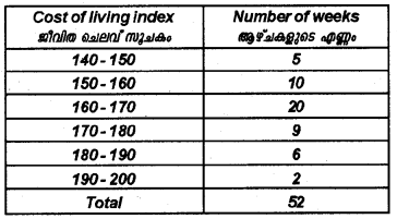
Draw a frequency polygon for the above data (without constructing a histogram).
Answer:
Question 16.
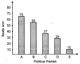
Given below are the seats won by different political parties of a state assembly election. (March 2014)
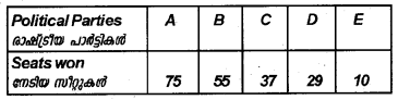
Draw a simple bar diagram to represent the polling results.
Answer:
Simple bar diagram
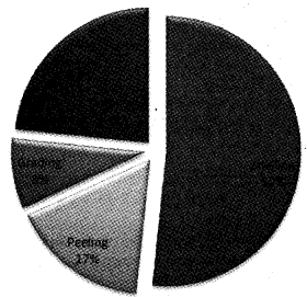
Question 17.
In a cashew factory, out of the 300 women workers, 155 engaged in the shelling, 50 in peeling, 25 in grading, and 70 in packing jobs. Can you represent it on a pie-chart? (Say 2014)
Answer:
Question 18.
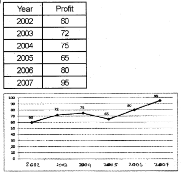
Data on the annual profit of a firm is given below: (March 2015)
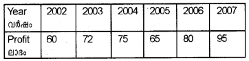
Draw the Arithmetic Line graph (Time Series graph) for the data.
Answer:
Question 19.
Draw less than ogive and more than ogive for the data given below in a single diagram. (March 2016)
Answer:
Question 20.
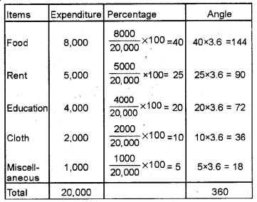
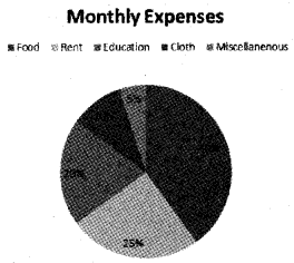
The monthly expenses of a family are given below. Represent the data in the form of a pie diagram. (Say 2016)
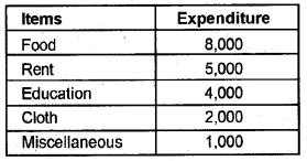
Answer:
Question 21.
Distinguish between bar diagram and histogram. (March 2017)
(Hint: Not to draw diagrams)
Answer:
A histogram looks similar to a bar diagram. But these are different which are given below.
| Bar Diagram | Histogram |
| Importance to the height of rectangles only | Equal importance to the height and width of rectangles |
| Use of discrete and continuous variables | Use of continuous variables only |
| Some space must be left between rectangles | No space is left between two rectangles |
| Cannot construct frequency polygon | Used to construct frequency polygon |
| Unable to find out the value of average like mode | It gives the value of mode |
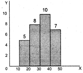
Question 22.
Observe the graph. It is _________ (March 2017)
a) Uni-modal data
b) Bi-modal data
c) Multi-modal data
d) None of these
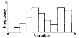
Answer:
b) Bi-modal data